The Interface
Pod's main window has three persistent pieces: the navigation rail down one side, the working area in the middle, and the status bar across the bottom. This page explains each rail item, each status-bar indicator, the keyboard shortcuts, the command palette, the sync popover, and the update banner.
The navigation rail
The rail is a narrow vertical strip, 68 pixels wide. By default it sits on the left, but you can move it to the right side in Settings. The Pod mark sits at the top, the feature buttons fill the body, and the Settings button is pinned to the bottom with a small gap above it.
Each button is an icon, not a label. From top to bottom in the default order, the feature buttons are Characters, Skills, Industry, Mail, Calendar, Wallet, and Assets. You can reorder these seven buttons in Settings; the Pod mark and the Settings button stay fixed. Click a button to switch the working area to that screen.
Active item and accent
The button for the screen you are on reads as active. Its icon brightens to the primary text color, the icon cell takes a faint highlight, and a short vertical plasma bar appears on the left edge of the cell. Every other button stays dimmed until you hover or select it. There is one active button at a time.
Unread badges
Two buttons can show an attention badge: a small plasma dot in the top-right corner of the icon. Mail shows the dot whenever you have unread mail. Calendar shows the dot whenever an event needs your attention, such as a pending response. The dot is a yes-or-no signal and does not carry a number. It clears once the underlying count returns to zero.
A third signal sits near the bottom of the rail: the notification bell. It carries an unread count and opens Pod's notification center, the in-app feed of skill, industry, mail, and other events, with new ones popping as bottom-right toasts. See Notifications for the full feature.
Which buttons appear
Most rail buttons are tied to a feature you can turn off. Assets, Calendar, Industry, Mail, Skills, and Wallet each belong to a feature. If you disable that feature in Settings, its button disappears from the rail, and the screen behind it is no longer reachable from the rail. Characters and Settings are not tied to any feature, so they are always present. Turning a feature back on restores its button in its previous position in the order.
Disabling an individual sub-feature no longer removes the whole rail button. It hides just that one sub-tab inside the screen. A feature button leaves the rail only when the entire feature is off; turn off a single sub-feature and the button stays, minus the sub-tab you switched off.
Rail flyout and sub-rail
Many feature screens have their own inner sub-sections, and the rail can surface those sub-sections without making you open the screen first.
Hover a rail icon and a flyout cascade floats out beside it: a small side panel that lists that feature's sub-sections. Click one to jump straight to that inner sub-tab. Move the pointer away and the flyout folds back, leaving the rail at its narrow width.
You can also keep the sub-sections on screen all the time. Persistent sub-rail mode adds a second rail strip next to the main one, showing the current feature's sub-sections as a standing column you click between. The flyout cascade and the persistent sub-rail are configured in Settings.
Characters and Settings
The Characters button opens the roster, where you add accounts, manage characters, and open a character's detail view. It is the home screen and the place to pick which pilot you are looking at. The Settings button at the bottom of the rail opens the settings window. Settings groups its own options into categories, and the About page, which shows the version and credits, lives at the bottom of the Settings category list rather than as a separate rail button.
Keyboard shortcuts
Pod has a small set of global keyboard shortcuts. They work from anywhere in the main window. On macOS they use Cmd; on Windows and Linux they use Ctrl.
- Ctrl/Cmd+Q quits Pod. This now works on every platform.
- Ctrl/Cmd+, opens Settings.
- Ctrl/Cmd+K focuses the primary search box of the screen you are on. On a screen with no search box it does nothing.
- "/" opens the command palette. The slash key only opens the palette when no text input is focused, so typing a slash inside a search or compose field types the character instead of popping the palette.
- Esc dismisses the topmost open modal or overlay, one layer per press when several are stacked, the same as clicking outside it.
While the command palette is open, four more keys drive it.
- Up and Down move the selection through the result list.
- Enter activates the selected result.
- Esc closes the palette.
These shortcuts are a fixed set. They are not user-rebindable.
Command palette
The command palette is a fast way to jump anywhere or run a common action without reaching for the rail. Press "/" with no text input focused to open it, type to filter, and the palette folds the whole app into one searchable list.
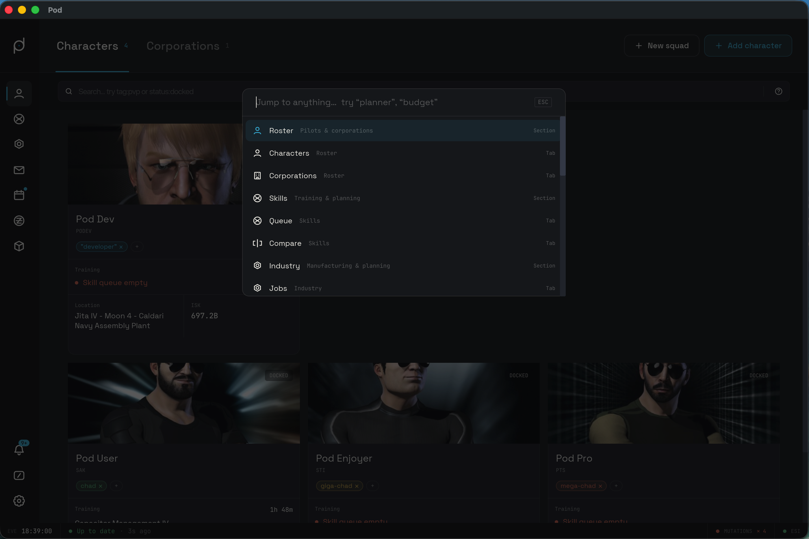
The list is a unified fuzzy search across three kinds of result.
- Commands. Common actions you can run on the spot, such as "Sync now", "Open Settings", "Add character", "Toggle high contrast", "Compose mail", "Create stockpile", and "Manage skill plans".
- Navigation. Any feature section, or a specific inner sub-tab reached by deep-nav. Picking a section opens that screen; picking a sub-tab jumps you straight to that inner view.
- Entities. Your characters and corporations by name. Picking one routes to its detail view.
Each result carries a kind tag on the right that names what it is. The tags are Character, Command, Corporation, Section, and Tab. Use the Up and Down keys to move, Enter to act on the highlighted result, and Esc to close without choosing.
The status bar
The status bar runs along the bottom of the window with a thin rule above it. It reads as two zones. The left zone shows the EVE clock and the sync chip. The right zone shows the ESI connection indicator, and, when relevant, a pending-mutations indicator. Thin vertical dividers separate the groups.
EVE clock
The left end shows the label EVE followed by a clock in HH:MM:SS. EVE Online
runs on UTC, so this is the in-game server time, not your local wall clock. It
ticks once per second.
Sync chip
To the right of the clock is the sync chip: a colored dot followed by a short line of text. The chip is Pod's at-a-glance summary of background syncing. Its dot color and wording change with the engine state. Click anywhere on the chip to open the sync popover described below; the chip tints faintly while the popover is open.
The chip leads with freshness. It reads the whole queue and shows the state that needs the most attention first, so anything waiting or failing wins over a pass in progress, which in turn wins over a settled queue. The words stay calm; only the dot pulses during a routine refresh.
- Up to date. A green dot with
Up to date. Everything has settled. Once the queue is fully settled, a quiet relative time joins the chip as a steady aside, such asUp to date · 2m ago. A routine mid-refresh leaves the words alone and never decorates them with a churning timestamp; the relative time appears only after the last job lands. - Catching up. A plasma dot with
Catching up… N left, where the count is the number of jobs the engine has not reported on yet. The dot pulses in plasma while a pass is in flight and rests in a muted plasma between ticks. - Needs attention. An amber dot with
N need attentionwhen some jobs are waiting or blocked, such as a missing scope or a job whose prerequisites are not met. The dot and text turn red when a job has persistently failed. Open the popover to see which endpoint and why. - Read-only. An amber dot with
Read-only. Another copy of Pod on your network holds the sync lease, so this instance reads the shared data but does not sync. When Pod knows the holder's hostname, the chip names the host that has it open. ATake overbutton appears next to the chip so you can claim the lease. - Sync stopped. A red dot with
Sync stoppedwhen the sync engine is not running. ARestart syncbutton appears next to the chip to start it again.
The chip carries no percent or job counts; those live in the popover header. The
running total it does carry is the N left count while catching up and the
N need attention count when something is waiting or failing.
Syncing is automatic. Pod polls your characters on a short cycle and you do not
trigger it by hand. The Take over and Restart sync buttons are the only sync
controls in the status bar, and they appear only in the read-only and stopped
states.
Pending mutations
When you make a change that Pod sends back to EVE, such as sending mail or
responding to a calendar event, it queues as a mutation in an outbox. While any
mutation is in flight or retrying, a MUTATIONS indicator appears in the right
zone with a count. A plasma dot and a ↻ count show work still in progress; a red
dot and a ✕ count show mutations that failed. The indicator disappears once the
outbox is empty.
ESI status
The right end shows a dot and the label ESI. ESI is EVE's data service, the
source for everything Pod syncs. A green dot means Pod is reaching ESI. A red dot
means it cannot. A red ESI dot explains why the sync chip is stalled or showing
errors: nothing can sync while ESI is unreachable.
The sync popover
Click the sync chip to open the sync popover. It is a card that lists every sync job, grouped by character, with live status for each one.
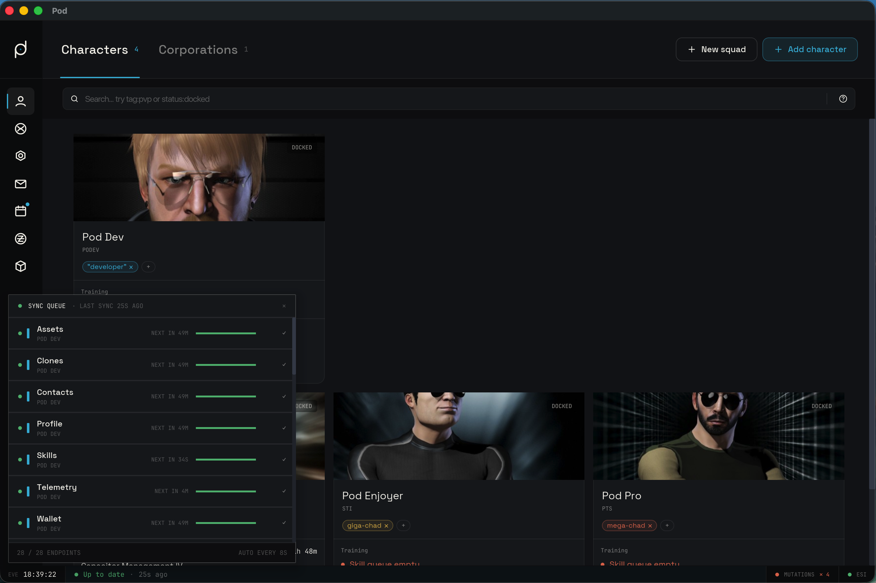
The header reads Sync queue with a dot and a one-line summary. When idle, the
summary shows the last sync time, such as · last sync 2m ago, or · idle if
nothing has run yet. While a pass is active, the summary shows counts such as
· 3 active · 5 queued · 60%, and the dot pulses in plasma. A close glyph on the
right dismisses the card.
Below the header is one row per job. Each character contributes a fixed set of jobs: Assets, Clones, Contacts, Profile, Skills, Telemetry, and Wallet. A job only appears if its feature is enabled; Profile always runs and always shows. A short colored bar on the left of each row matches the character's color, so you can scan a character's jobs together. The list scrolls when there are more jobs than fit.
Each row carries a state, shown by its marker dot, its progress fill, and a glyph on the right.
- Fresh. A green marker, a check glyph, and a
Next incountdown such asNext in 42mshowing when it will run again. AFreshrow covers both a job that fetched data and one that ran and found nothing; an empty result reads as a benignNo datasub-line. - Refreshing. A plasma marker and the word
Refreshing; this job is fetching now. A job backing off before a retry staysRefreshingtoo, and its sub-line readsRetrying in 30s. A backoff is a calm self-healing state, not an error. - Catching up. A dim marker and the words
Catching up; this job has not been reported on yet and is waiting its turn. This replaces the oldQueuedrow. - Failed. A red marker with an exclamation glyph. The sub-line carries the failure reason. This is the persistent failure that the footer counts.
- Blocked. An amber marker with
Waiting on dependencies, or the reason the job is held, such as a missing scope. - Needs re-authentication. An amber marker with
Needs re-authenticationwhen a character's credential has to be renewed before the job can run.
The footer summarizes the whole queue: a done / total endpoints count, a
· N retry pending note in red that counts only persistently failed jobs, and a
reminder that Pod syncs automatically on its short cycle. A blocked or re-auth row
is attention, not a retry, so it stays out of that count.
Updates
Pod checks for new releases and, when one is found, surfaces an update banner with
the UPDATE eyebrow. The banner walks through the update as it progresses.
- When a new version is found, the banner reads
Version X is available.with anUpdate nowbutton. Press it to start the download. - While the download runs, the banner reads
Downloading version X…with no button. - When the download is ready, the banner reads
Version X is ready. Restart to finish.with aRestartbutton that relaunches Pod into the new version. - If the update fails, the banner switches to a red
UPDATE FAILEDeyebrow and shows the error message.
The same update notice can also appear as a small dismissible toast in the bottom-right corner. Dismissing the toast hides that reminder; it does not cancel the update.